Category:
Growth / Conversion Optimization
Client:
LoanTap


Overview:
Redesigned LoanTap’s end-to-end loan application journey by combining analytics, usability research, and adaptive UX. Delivered a unified flow with eKYC, Account Aggregator, document auto-validation, and UTM-driven personalization — resulting in 25% higher conversions, 40% faster onboarding, and 35% fewer drop-offs.
My Role: UX Design Manager (End-to-End Design Ownership)
Timeline: 2 months
Team: Product, Marketing, Tech, and CX Leadership
As the UX Design Manager, I led the complete end-to-end design process- from user research, journey mapping, and service blueprinting to final high-fidelity UI. The initiative required cross-functional collaboration with product, marketing, tech, and company CXOs to align user needs, business goals, and technical feasibility.
Outcome:
25% Better Conversions |
40% Quicker Onboarding |
35% Lower Drop-Offs |
Enhanced trust and clarity in the loan selection and onboarding process |
Problem Statement:
LoanTap offered multiple loan products tailored to different user segments — but the existing application journey was fragmented and confusing. Users often landed on product pages through marketing campaigns (Google Ads, WhatsApp, or Email) but struggled to understand eligibility, documentation, or the differences between loan types.
Key challenges identified | Objective |
|---|---|
Inconsistent flow across loan products caused high user drop-offs before completing the loan application. | Reduced cognitive load and minimized drop-offs. |
The landing pages lacked clarity and context, especially for first-time users unfamiliar with fintech terms. | Unified and simplified loan application flow. |
The process had redundant input steps and poor visibility into progress, creating frustration and loss of trust. | Increased user confidence through transparency. |
No clear journey continuity between marketing touch-points and the application portal. | Seamless alignment of business, user, and technical goals. |
Research & Insights
Key findings: |
|---|
Users struggled with understanding loan terms and eligibility criteria. |
High drop-off rates on product pages due to lack of clarity. |
Users wanted a streamlined, step-by-step process with clear progress indicators. |
Trust and transparency were critical factors in decision-making. |
Tools/Methods: | |
|---|---|
Qualitative Research : | User Interviews |
Quantitative Research: | Surveys, A/B testing, Heat-maps (Hotjar) |
Define & Ideate
Based on the research insights, we defined core personas and pain points that shaped our design direction. The focus was to simplify the journey for users applying for any loan type — while keeping business feasibility and compliance in check.
Primary personas identified: | ||
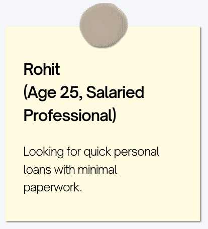 | |  |
|---|---|---|
Ideation workshops with stakeholders and the product team helped co-create initial design concepts. We explored: | ||
|---|---|---|
|
|
|
 | ||
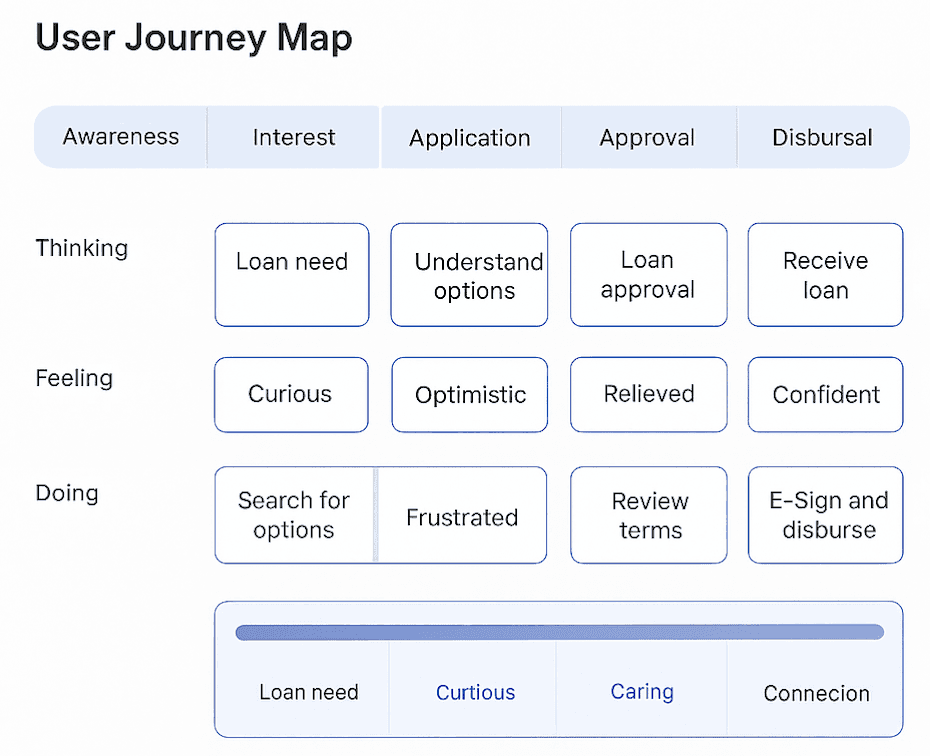
User Flow Overview
 | |
|---|---|
|
|
|
|
Key opportunity areas | Major design improvements |
|---|---|
Integrated eKYC, cKYC, eMandate, Account Aggregator to minimize paperwork and dropouts. | Unified loan selection dashboard. |
Introduce contextual education (loan terms, benefits, documents required). | Streamlined application flow. |
Streamline loan discovery and eligibility check. | Contextual education at relevant steps. |
Maintain consistent UI and tone across all loan types. | Multiple onboarding options. |
Make progress indicators and next steps more visible |
Wireframes and Prototype
Low fidelity wireframes |
|---|
 |
Working Prototype
Prototype |
|---|
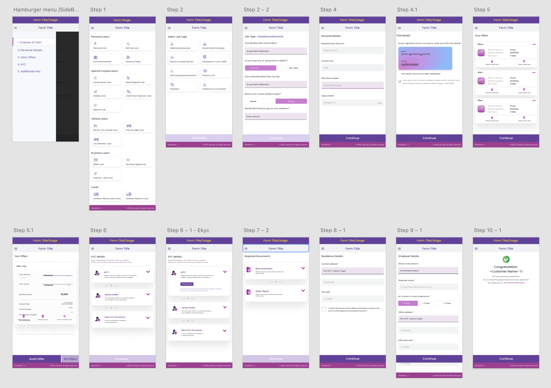 |
Production ready version
Outcome: |
|---|
|
|
|
 |

